Tag Archive for reality tv

Face Off 5.03: Mother Goose and All Her Friends

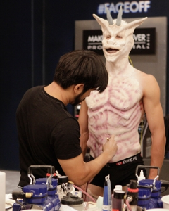
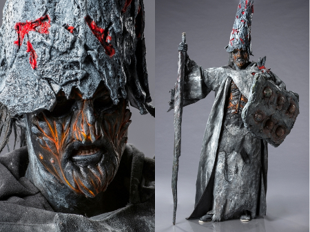
On season 5, episode 3 of Face Off, the 14 remaining makeup artists had two challenges that couldn’t be further apart from each other. I already covered the Foundation Challenge earlier today with the new episode of Sketchy Details @Home. In short, the contestants had to make original demons inspired by Insidious: Chapter 2, including a gender flip from male model to female demon.

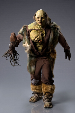
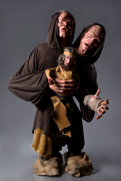
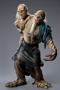
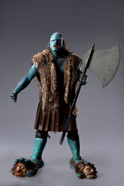
The Spotlight Challenge was a new spin on one of the show’s mainstays: design makeup that won’t make children run away screaming. The contestants had to pair up and choose a Mother Goose nursery rhyme to bring to life. The result was supposed to be whimsical, not terrifying, and almost everyone had to redo their design after meeting with Michael and Mackenzie Westmore in the workroom. Worst of all, it would be a double elimination and the worst pair would go home.

This season, thanks to the veterans versus rookies twist, has a lot more horror-friendly artists than usual. Frank, Tate, Alana, Roy, and Laura all excel at darker makeup challenges. That’s not even counting the rookies who mostly cite iconic horror films as their point of inspiration or describe their style as dark, creepy, or scary. This group doing cute makeup could have been a disaster.

Sketchy Details @Home 3: Something Insidious

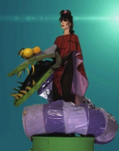
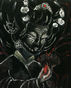
The third episode of Sketchy Details @Home is up and it’s a doozy. Inspired by Face Off Season 5 Episode 3, I took a nasty black velvet painting found at a yard sale and turned it into an original demon worthy of Insidious.

I mention it in the video but it bears repeating: the demon isn’t the draw of Insidious; the ghosts are. Like most of the contestants, I combined the ghost aesthetic with some unusual demon imagery and came out with something that made me very happy. This sucker is going to the centerpiece of the night club yard haunt green room, which the trick or treaters will pass through to get their candy.

Watch the video, then click through for all the behind the scenes gossip.

Face Off 5.02: It’s Alive

This week on Face Off, the remaining makeup artists were teamed up to create original futuristic Frankenstein’s Monster and Bride combinations for Universal Studios’ Halloween Horror Nights.

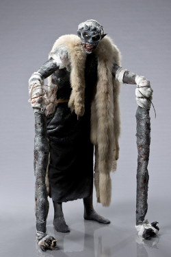
You know this challenge was right up my alley for the new episode of Sketchy Details @Home. In four days, I did all of the pre-building and detail work (but not full assembly) on my Monster drummer and his beautiful Bride as the band logo for the night club. Once the E6000 glue dries on the Monster, I can drill holes in the back of the frame to run lights through, cover the inside of the shadowboxes with this really cool Halloween scrapbooking paper I picked up at Michaels, and attahch it to the black box that will function as the Monster’s body behind the drum kit.

SyFy’s Heroes of Cosplay: Holding Out for a Hero (Or a Clue)

heroesofcosplayfun SyFys Heroes of Cosplay: Holding Out for a Hero (Or a Clue)

Play tunnels + foam = super fun cosplay

There are two minds of cosplay at conventions. The crowd I run with does it for fun. You choose a character you want to dress as all day, hang out with other fans, and do anything with photos or contests because it’s fun. So long as you aren’t hurting anyone or breaking the rules, you’re cool. Have fun.

The other thought is that you need to cosplay based on what you look like. Bigger people need to cosplay as bigger characters. A fat Superman is a distraction because it’s not accurate to the character and proves the cosplayer is clueless as to what their limitations are. These people will tell you to your face in front of a crowded show floor that your cosplay is bad and give you a bulleted of better characters or mistakes you’ve made with no shame.

The second episode of SyFy’s Heroes of Cosplay tackled this issue head on and it wasn’t pretty. Chloe Dykstra, host of Nerdist’s Just Cos, was invited to dinner with some award-winning cosplayers on the eve of her first contest. They looked on in horror a Chloe expressed that cosplay is something fun for everyone. If you want to dress as a character, dress as the character.

Face Off 5.1: What a Twist & Sketchy Details @Home

Face Off recaps are back at Sketchy Details and better than ever. Why? They’re multimedia now. I’ve spent three seasons telling you what I think of the contestants designs from the comfort of my computer screen. Now I’m going to show you.

Sketchy Details @Home is my new art/craft/pop culture vlog that launches with response videos to the new season of Face Off. Each week, I’m going to reinterpret the challenge on the show into something I can do on a similarly short time frame. Spoiler alert: a lot of the videos are going to be Halloween-related. I’m behind on my build and have too many characters to make to just sit back and put other projects up front.

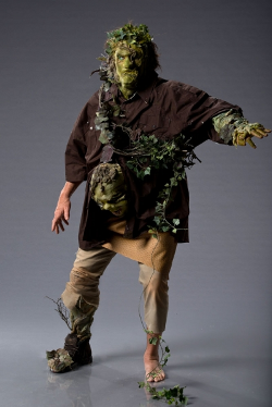
I actually started the first project yesterday in anticipation of putting the episode up today. That meant I did not have enough time to create the full figure, only the head, and I’m very happy with how it turned out. I went with a faun since it fit in with the inspiration for my home haunt this year.

Back: The Last Halloween Kickstarter

Penny Arcade’s Strip Search ended on Tuesday night and the contestant I backed the whole way through, Abby Howard, took second place. Per the judging, Penny Arcade creators Mike Krahulik and Jerry Holkins feared that Abby was better working under the pressure of the elimination round than she was creating a long-form strip on her own time.

I know editing doesn’t 100% reflect reality, but they both seemed to laugh as much at the comic strips she brought from home (final challenge: create a six page arc plus character sheets and logos) as they laughed at the comic strips she created on the spot (final elimination: three comics in four hours using the comic you developed at home and two words from the Wastebasket of Broken Dreams). She also created the only strips on the spot that they liked as much as the strips created at home. That, to me, shows she had the best-developed idea and the most preparation to create a strip in the PA offices for a year.

But I’m not bitter. Nope. How can I be when I’ve become a fan of all three finalists and liked their pitches for new comic series? Camp Wheedonwantcha is going to be a hoot. All three contestants went dark and funny so, really, I had to be happy with the winner.

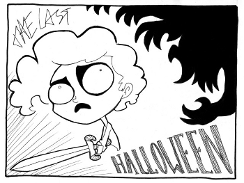
thelasthalloween Back: The Last Halloween KickstarterAnd why be bitter? Abby Howard funded the Kickstarter for her online graphic novel The Last Halloween in well under a day. The Kickstarter went live with a goal of $9000 yesterday and stands at $55077 today with 23 days to go.

So she funded her project already. Why write about it at all?

Simple. Talent this strong deserves support. The Kickstarter covers the production and distribution of the first of three graphic novels in The Last Halloween series. The entire series is written. She just needs the time and money to draw them out. The more she earns to live on, the faster we get the full series.

On the finale, she said she can bang out the first book this summer. From there, she would release one complete scene a week rather than a page every few days. That in itself is something that should be supported in online comics. I love a good long-form comic series, but an update schedule of one page a week or every few days means hoping your fans have the patience to come back when the story inevitably has to slow down.

thelasthalloweeninvisibleman Back: The Last Halloween Kickstarter

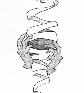
Stunning linework

Not with The Last Halloween. Abby’s going to post a complete scene, about three pages, every week. She gets to break up the story and control the pace. This will go a long way to mitigate the usual critiques of slowing down the story to earn more money or stalling because the creator ran out of ideas.

So what’s The Last Halloween about? Mona, a young girl, discovers that monsters plan on destroying Earth on Halloween night. This little girl starts to see little ghosts who agree to help her fight the unimaginable evil plotting against humanity. The series is illustrated in Abby Howard’s beautifully expressive black and white style and has humor as dark as the ink on the page.

What? Did you think I was going to advocate for a happy comic with no horror this hard?

The Kickstarter video for this project needs to be seen to be believed.

You can back The Last Halloween here.

Watch: Penny Arcade’s Strip Search

The push goal I was most excited for when webcomic Penny Arcade went to Kickstarter to go ad-free for a year was their pitch for a new reality show as season four of Penny Arcade: The Series. They would invite a group of comic artists to fly out to an unspecified location to compete for a chance to win, among other things, a year’s stay in the PA offices and a cash prize. The Kickstarter earned enough for the show, so the casting process was on.

stripsearchlogo Watch: Penny Arcades Strip SearchThough I very much doubted my chances, I applied for a spot on Strip Search. I used clips from my first webcomic, Food Don’t Go Stale in Space, as well as my now-defunct due to time constraints (and eaten by ComicPress) Week in Media series. I also used examples of my actual painting and graphic design work and even some of my reality TV recaps that used webcomic formatting in my portfolio. The application was one of the more challenging ones I’ve filled out for a reality TV show (always good to know the aim of casting when critiquing a show) because of its breadth. Strip Search was looking for the total webcomic package: art, writing, marketing, and merchandising. Unsurprisingly, I didn’t get past the open call stage.

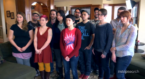
The contestants who did make it onto the show represent a wide range of style and experience. Some of the contestants are pretty inexperienced at creating a webcomic and some are professional artists for animation studios. Some run their own businesses and some had to quit their jobs to even go on the show.

What they share, and what comes across so strongly in Strip Search, is a passion for what they do. The artists are there to compete for a life-changing prize but they all seem to realize how fortunate they are to have this opportunity. The level of game playing after the first complete challenge to elimination experience is strategically choosing to not be the villain.

stripsearchcasting Watch: Penny Arcades Strip Search

I have never seen such a timid and unassuming reality show cast before. I would have fit right in.

Even more telling is the confessional montage at the end of the first episode. All but three of the contestants admit that they don’t know if they can win. The three who do admit it aren’t super aggressive about it. There’s no “Send everyone else home, I came to win” aspect on this show like so many other competitive reality series. The season preview has one contestant saying the infamous “I’m not here to make friends” sound byte but I have a feeling she’s not being malicious in that moment.

The challenges are a mix of having fun and actually running a webcomic. In the second episode, the artists play a very long game of Fax Machine. Each artist starts by writing a caption for the next person to draw. The next person draws the prompt on a separate page. The person after them has to write what they think the caption was for the previous illustration. The Fax Machine challenge did have a prize and a winner, but it was a totally casual affair to warm the contestants up.

The elimination challenge shown in episode three brought the artists right into the business side of running a webcomic. They had to design a t-shirt inspired by the Strip Search graphic with no more than four colors–black plus three others. The winner would have their shirt sold on the Penny Arcade website and earn all the profits from it. Even within what was essentially a challenge to market someone else’s brand, the artists had plenty of room to show their own style.

More

Face Off 4.7-4.8: Werewolves and Sea Monsters

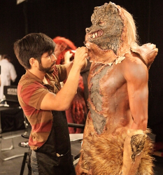
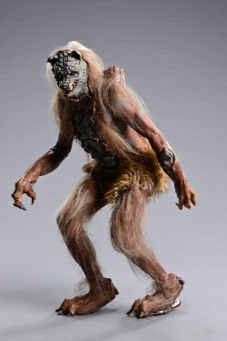
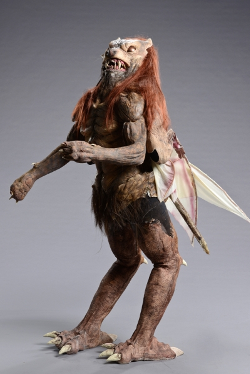
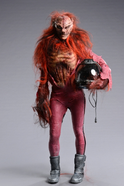
Last week on Face Off, the eight remaining contestants were paired up to create sci-fi werewolves. They had to use moons of other planets as a jumping off point for an original werewolf design.

faceoff4.07conflict Face Off 4.7 4.8: Werewolves and Sea Monsters

All I know is that Autumn wasn’t the one who kept chopping off sculpts and walking away without saying anything

I’m all for carving a story arc out of the footage you have on a reality show, but it has to be a believable story. This episode was “let’s blame Autumn for every problem because she’s a negative, depressed bully.” Nothing on the show up to this point has suggested that at all. Just having one of the weaker contestants of the season who never spoke up before suddenly say “she was mean to me” doesn’t mean that Autumn bulldozed over anyone.

Here’s what I saw from the footage presented. Autumn came up with a great concept and Eric Z. agreed to it. She started on a face sculpt, cut in rough forms, and Eric Z. insisted he take over the face sculpt. He hacked off all over her work instead of collaborating. She insisted on going back in and taking over her original role. Meanwhile, instead of continuing with Autumn added to his back sculpt, he started that all over again, too. Eric Z. put the team behind by refusing to collaborate or even communicate and the resulting look was unfinished. He refused to assert himself and verbalize any concerns until he threw her under the bus at judging.

The challenge was underwhelming as a whole because the only team to actually make a sci-fi werewolf was Autumn & Eric Z. and Autumn got sent home because of her…attitude? She was as blind-sided as I was. This is what she sculpted (since Eric Z. just kept erasing the concept they agreed on and she carried the team). It’s a werewolf with a rock core to fight the gravity of Jupiter.

faceoff4.07autumnericz Face Off 4.7 4.8: Werewolves and Sea Monsters

Anthony & Eric F. were also in the bottom and their design was a mess. Their werewolf had an extra set of arms on the back and wings. The facial appliance was messed up beyond belief and the edges could be seen from the judges table clear across the room. Because neither of them acted like a two-year-old at judging, they were safe.

faceoff4.07anthonyericf Face Off 4.7 4.8: Werewolves and Sea Monsters

House & Meagan did sci-fi by putting neon pants and a space helmet on their Martian werewolf. This was a top look. The face sculpt looks like what Autumn wanted to do before Eric Z. kept ripping the clay off the form.

faceoff4.07housemeagan Face Off 4.7 4.8: Werewolves and Sea Monsters

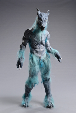
Kris & Wayne won the challenge with a blue werewolf straight out of a Looney Tunes short. It looked like a rubber monster suit but the judges liked it. They really liked the back sculpt, so Kris was named the winner of the challenge.

faceoff4.07kriswayne Face Off 4.7 4.8: Werewolves and Sea Monsters

I haven’t disagreed this much with a decision on this show since they allowed Sam in Season 1 into the finale and then eliminated her before they actually deliberated on the finalists. This was just a bizarre and disappointing challenge with a terrible edit. If they wanted to eliminate a contestant because they never cared for her work, they should have said it. Autumn landed in the bottom more than the top and didn’t always finish her designs. That does not mean they had to fabricate drama to get rid of a middling contestant on the show.

Face Off 4.6: Creepy Crawlies

This week on Face Off, the nine remaining makeup artists were presented with an interesting challenge. McKenzie Westmore instructed the designers to choose a beautiful, abstract image to inspire the color scheme and texture of their next Spotlight Challenge. Once the screens were assigned, McKenzie revealed the real challenge. The photos zoomed out at a rapid pace until nine colorful insects were revealed. Each contestant had to incorporate the colors and texture from the original photograph into a full body insect-inspired makeup design.

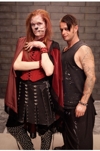
faceoff4.06foundation Face Off 4.6: Creepy CrawliesBut first, the contestants had a fun Foundation Challenge. They had to reinvent fairy tale characters. It was a very short segment on the show, but the contestants clearly had a lot of fun with it. Eric F. won for a disfigured Red Riding Hood and picked up a big prize in a large Makeup Forever kit and immunity for the week.

The Spotlight Challenge excited most of the contestants and resulted in a lot of strong looks. I can only assume the scores were so close that the judges couldn’t choose a third top look from the clear top six.

The top looks for the challenge were Kris and Wayne.

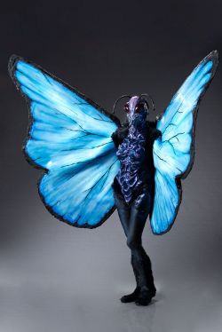
Kris had to create a butterfly and went big. He crafted massive wings to make the model’s head look proportional to the body. When the anatomy books failed to show the detail on the butterfly’s thorax, Kris took the patterns from the macro photo of the head and sculpted an elaborate labyrinth of ridges over the body. It was a very literal design (sans thorax) but a striking design.

faceoff4.06kris Face Off 4.6: Creepy Crawlies

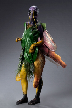
Wayne had to create a firefly. He took a more abstract approach than Kris, crafting representational wings as a cape in the back. He used color blocking to define the shape of the insect and even created a glowing tail. The huge glossy eyes were very expressive with the movement in the face. The placement of the nostrils over the model’s eyes was the perfect choice.

faceoff4.06wayne Face Off 4.6: Creepy Crawlies

Unfortunately for Wayne, he didn’t actually complete the challenge because he left his reference photo in the workshop before he painted the makeup at last looks. Kris won by default and the judges made that very clear. I would like to applaud Ve Neill for finally getting her way and convincing the judges to reward a contestant who met the challenge rules over a far more innovative design that didn’t conform to the challenge. She’s made that case a few times before and this was the first time it stuck.

The bottom looks were Alam, Anthony, and Meagan. They all wound up there because of bad time management.

Alam had to create a grasshopper. She tried to tackle way too much by herself. She ran silicone appliances for translucency, crafted wings, legs, and tail out of foam and fabric, and costumed the creature with nontraditional materials. The whole thing was a mess on the stage because it wasn’t finished. The concept was great, but the execution wasn’t there.

faceoff4.06alam Face Off 4.6: Creepy Crawlies

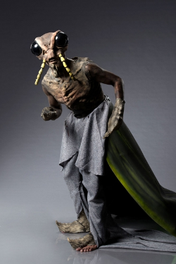
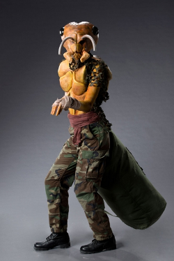
Anthony had to create an army ant. He was immobilized by the challenge. Nothing was particularly inspiring and he wasn’t satisfied with anything he sculpted. He went super literal as a last resort and failed to complete his makeup. The biggest issue was uncovered foam antennae right smack in the middle of the face.

faceoff4.06anthony Face Off 4.6: Creepy Crawlies

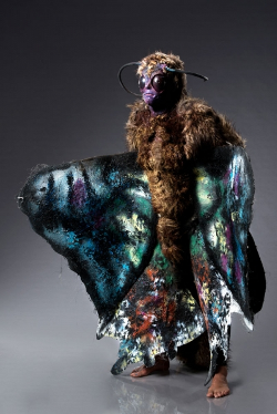
Meagan had to create a moth. Her design was great. The sculpt looked really good. She even went risky with an accurate look showing the moth in its true hair-covered form. She just really screwed up the paint job. It looked like she shot paint balls at the model and threw her on the stage. It was a big shame since a better paint job could have given her the win.

faceoff4.06meagan Face Off 4.6: Creepy Crawlies

Ultimately, it was Alam’s inability to explain her design that sent her home. I wonder how much was creative confusion and how much was a matter of translation. She did not performed well when talking to the judges the entire season and I can’t tell if it was nerves or genuine misunderstanding. Either way, her look was the least polished on the runway and had major technical flaws in application–rough edges, too much paint on silicone appliances, and unfinished foam accessories.

So what did you think? Like the images? Check out all the SyFy Face Off Galleries. Share all your thoughts below.

Face Off 4.5: They Might Be Giants

Last season, when Face Off tried to integrate film promotion into the show, the challenges suffered. Remember when Nicole went home for her Alice in Wonderland meets Resident Evil virus makeup? She wound up winning the competition anyway and soaring on challenges that provided a fair creative outlet, not an hour of promotion for an upcoming film.

Last night, Face Off stepped up the production promotion challenges big time. The 10 remaining contestants had to create multi-headed giants that Jack the Giant Killer might have slain when he climbed the beanstalk. Bryan Singer, the director of the upcoming Jack the Giant Killer, was the guest judge.

faceoff4.05giantchallenge Face Off 4.5: They Might Be GiantsEverything about this challenge was a great creative exercise. The teams had to figure out realistic integration of multiple heads into a single makeup and make the creature look colossal. 6’4″ and up models helped, but these makeup artists actually had the skills to make them look towering. All of the concepts were strong and beautifully sculpted. The bottom teams came down to application and aesthetics.

The top looks were Anthony & Autumn, Eric F. & Kris, and House & Wayne.

Anthony & Autumn proved to be a strong collaboration with their twisted giant concept. Their creature consumed its victims, forcing their heads to break through the surface and guide what you would assume is the head of the operation. Each of the three heads was sculpted with a great eye for detail and a distinct personality. The paint and styling were really beautifully executed, as well.

faceoff4.05anthonyautumn Face Off 4.5: They Might Be Giants

Eric F. & Kris created the largest makeup in the history of the show. Their giant was a towering 10 foot tall beast with two heads. The model’s head was attached to the body of a human battling the blinded giant. His body was the legs and lower torso of the massive creature towering over him. The whole thing was a brilliant concept to trick the eye into thinking the giant was even bigger than it was.

faceoff4.05ericfkris Face Off 4.5: They Might Be Giants

House & Wayne took the more obvious route to create an interactive two headed giant. The beast only had one arm. The second arm was replaced with a head that could be manipulated as a puppet by the model. The expressiveness of the second head was really impressive. I wasn’t blown away by the paint job. I think it actually took away from the impact of the really strong collaborative sculpt. This duo worked on every part of the sculpt together rather than delegate tasks. It was a risk that really paid off.

faceoff4.05housewayne Face Off 4.5: They Might Be Giants

The winner of the challenge was Eric F. who finally got recognized for what I can only assume is a pro haunter’s ingenuity. I know House works haunts but haven’t heard confirmation of Eric F. doing the same.

The bottom looks were Alam & Eric Z. and Jenna & Meagan.

Alam & Eric Z. wound up on the bottom purely for aesthetic reasons. I loved their concept but the judges weren’t having it. They created a giant who tortured his victims by implanting their heads in the base of his feet. That was supposed to be their punishment for misdeeds, forced to tread the earth forever with a voice but no way to stop the punishment. The judges thought the sculpt looked cartoonish; I thought it was brilliant and can’t wait to see what Alam and Eric Z. come up with in the coming weeks. They both have a very wacky aesthetic that I love.

faceoff4.05alamericz Face Off 4.5: They Might Be Giants

Jenna & Meagan suffered from time management issues. Jenna was actually able to sculpt well enough with her bad hand to create a decent cast this week. The team just did not click at all. They fought over how to mold, sculpt, cast, and paint–every decision was a battle. If they found common ground, they could have produced a great makeup. Instead, their two heads stacked on top of each other concept became a half-finished, falling apart mess with a slap dash story used to sell the incomplete makeup.

faceoff4.05jennameagan Face Off 4.5: They Might Be Giants

Ultimately, Jenna was sent home. The judges even acknowledged that it was because of her hands. They know from the first week how strong she really is–both of her looks wound up in the top and she sculpted like a madwoman–but she physically was not in the place to compete this season. It’s very sad to see someone go home for this kind of thing. It was also the only fair decision. Meagan hasn’t produced anything particularly strong yet, but at least she’s capable of keeping up with the challenges.

So what did you think of the giant challenge? Photos came straight from SyFy in the Face Off galleries.

Face Off 4.4: Sweet and Twisted Like a Licorice Stick

This week on Face Off, the 11 remaining makeup artists were actually shown doing two challenges again. I have to wonder if they even make them do Foundation Challenges in each episode shooting cycle anymore. Other shows occasionally cut these challenges when they don’t have an impact on the overall narrative, but Face Off is cutting them more often than not the past two seasons.
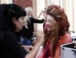
faceoff4.04beards Face Off 4.4: Sweet and Twisted Like a Licorice StickThe Foundation Challenge was a funny one. Inspired by mustache and beard competitions, the contestants had to lay a full beards on their models. The twist? They would create original bearded ladies using hair, makeup, and wardrobe. The winner was Eric Z. for applying the most realistic beard, though a few of the fantasy designs received strong praise. Eric Z. earned immunity for the Spotlight Challenge.

The Spotlight Challenge might be the best so far in the history of Face Off. The contestants returned to the workroom and found an elaborate display of candy. MacKenzie Westmore informed them they had to create candy/creature or human hybrids using actual candy. They were supposed to take inspiration from the ironic punishments of Willy Wonka and reflect how consuming too much candy would transform their character.

There are so many ways the artists could go with this challenge. They weren’t required to go after a certain aesthetic. They just had to reflect the candy they chose in their designs. Some candy is sweet and some candy is sour. Not every hybrid creature is a total monstrosity and not every contestant on this show is a blood and guts special effects makeup artist.

The top looks were Alam, House, and Kris.

Alam created a living doll in the stereotypical anime style. She used a variety of rainbow-hued candy to create an original wig and costume. Her facial sculpt gave her doll a tiny upturned nose, high cheekbones, and pointy little chin that looked like a cartoon come to life. The beauty makeup was very well done, especially the the large manga eyes painted over the top half of the face.
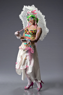
faceoff4.04alam Face Off 4.4: Sweet and Twisted Like a Licorice Stick

House went in the opposite direction completely. His character was a deranged young woman with an extra large sweet tooth. Make that sweet teeth. He sculpted a flexible mouth of rotting candy in the stomach of the model. The candy was all over the place in this design, most notably with gummy hair and rolled up sour candy strip eyes.
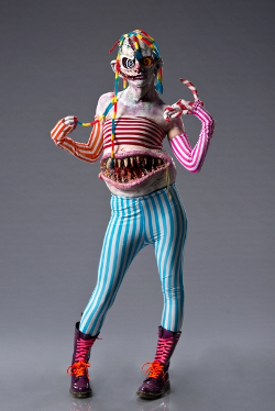
faceoff4.04house Face Off 4.4: Sweet and Twisted Like a Licorice Stick

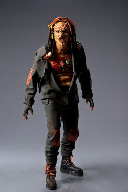
Kris, out of all the contestants, took the challenge to heart. He actually sculpted with the candy pieces, giving him plenty of places to glue down actual candy in the design once the appliances were cured. His design was not the most striking by any stretch of the imagination. He was simply the contestant who really got into the inclusion of candy in the prosthetics and he did it very well.
faceoff4.04kris Face Off 4.4: Sweet and Twisted Like a Licorice Stick

The winner of the challenge was Kris. The judges loved how much candy he incorporated into the design and how polished the overall look was. Oh, so now actually having clean edges and a solid concept is enough to win on Face Off? Where was that kind of judging when Sam from Season 2 routinely had the best finishing of any contestant in the competition and couldn’t even get into the top 3 on a challenge?

The bottom three looks for the candy challenge were Alex, Autumn, and Jenna.

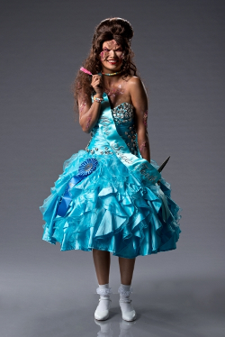
Alex’s biggest problem was concept. She created a blood-thirsty pageant queen who ate too much rock candy. What eating too much rock candy has to do with child pageants, let alone stabbing people with scissors, is a mystery. Then the judges walked up to her design and saw that the facial prosthetics weren’t actually glued down properly. They could literally stick their fingers under the bottom flap of her prosthetics.
faceoff4.04alex Face Off 4.4: Sweet and Twisted Like a Licorice Stick

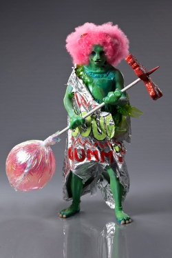
Autumn’s biggest problem was her sculpt and she knew it. Her concept was cool, a man turned into a gummy bear, but her execution was really off. No matter what she did, she could not get the bear nose right. The end result looked like a cartoon cat with really rough edges. I think if she settled on the sculpt sooner, she would have had the time to worry more about polish on the hand and feet prosthetics.
faceoff4.04autumn Face Off 4.4: Sweet and Twisted Like a Licorice Stick

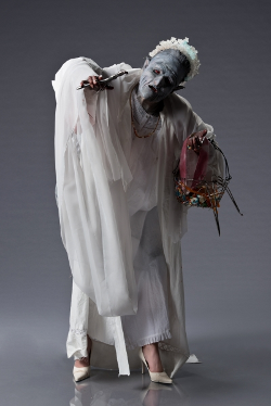
Jenna’s biggest problem was herself. Her hand is still bothering her a lot and she didn’t have the sensitivity of touch to actually bring her sculpture alive. She could have saved it with the paint job, but she couldn’t actually regulate the pressure on her airbrush because of her hand. She couldn’t even properly glue down the prosthetic on the face, which slid and then buckled before the judges did their closer look.
faceoff4.04jenna Face Off 4.4: Sweet and Twisted Like a Licorice Stick

Ultimately, Alex was sent home for not knowing how to work with silicone prosthetics. The judges seemed shocked when she admitted that she did not know she had to seal the edge of a silicone prosthetic to get it to stay on. The wacky concept didn’t help.

How about this for a twist? Face Off has a new web series to go with season 4. The first four eliminated contestants competed in a Foundation Challenge for the chance to earn a spot on Season 5. The winner moved on to compete with the next batch of eliminated contestants. The losers actually went home (or into sequester, but they ain’t getting on Season 5 without a fight). You can watch the episode here. It’s really well done.

Like the images? Check out the SyFy Face Off galleries for all the great shots from the episode.

So what did you think? I loved the challenge and think the contestants, overall, did a great job with it.
Face Off 4.3: Frosty

On the newest episode of Face Off, the remaining 12 makeup artists were partnered up to bring mythical demons to life. We finally got a look at how the script changes–mid-challenge alterations to the original task–work. They’re a good twist on the format. Instead of creating accurate representations of the demons, the artists have to create accurate versions of the demons in ice forms. Hell froze over and these monstrous beings are cold and angry.

faceoff4.03demonworkroom Face Off 4.3: FrostyThe challenge was a solid one, though I wish they got their facts straight about these demons. They’re mythological creatures, but that doesn’t mean that SyFy gets to fabricate whole new stories about them. There was no excuse for choosing one particular demon that they couldn’t even get the right name of. If I had been in the workroom, I would have called them out on it, especially since the form of the name would have clued me into general styles I could incorporate into a design. I would have been pissed to find out they meant another figure with limited information available rather than a much more expansive character that would stand out in the challenge.
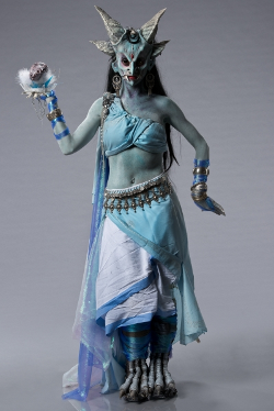
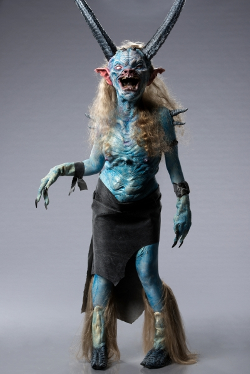
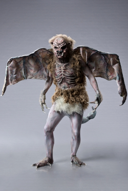
The top looks for the challenge were Alam & Anthony and Eric F. & Wayne.

Alam & Anthony probably had the hardest challenge, taking on a non-demon figure in Demus. Demus, more commonly Durga, is the warrior form of the Supreme Goddess in Hinduism. Her appearance is strange but she is not a dark spirit like the other creatures in the challenge.

Alam & Anthony reflected this perfectly. Their Demus was a beautiful and intimidating figure. They abandoned the many arms of the goddess, giving her an elaborate series of horns and blue skin. The styling is really what sold the look, with an ice blue sari, elaborate gold jewelry, and a bindi.

faceoff4.03alamanthony Face Off 4.3: Frosty

Eric F. & Wayne had a more traditional demon concept to work with. Chort is the being of total evil in Slavic mythology. He has all the tropes of the traditional devil–horn, hooves, claws, and tail–plus the face of a pig.

Eric F. & Wayne landed in the top because of their execution of a very difficult sculpt. They created a large head with a deep, cavernous mouth the model Could see out of. I wasn’t crazy about the styling or the actual look of the face, but it was an effective representation of a very twisted demonic figure.

faceoff4.03ericfwayne Face Off 4.3: Frosty

Alam & Anthony’s Demus was declared the winner, with Anthony taking the victory (two in a row) for his face sculpt over Alam’s styling, paint job, and feet sculpt.

The bottom two looks were Alexandra & Autumn and Jenna & Katie.

Alexandra & Autumn had the iconic Pazuzu. Pazuzu, best known for his appearance in The Exorcist though best loved for his appearance as the Professor’s pet in Futurama, is an Assyrian and Babylonian demon. He brings famine and locusts as a grotesque blend of scorpion, lion, dog, eagle, leathery wings, serpent, and human.

I actually liked Alexandra & Autumn’s design and execution, so it’s a bit of a struggle to relay why they were in the bottom two. What it seemed like was that there were five very strong looks and the show couldn’t just have the losing team on the bottom. The judges dinged them for the construction of the wings and not adapting their very flexible design to specific cold weather concepts.

faceoff4.03autumnalexandra Face Off 4.3: Frosty

Jenna & Katie had Eurynome, which I assume was supposed to be Eurynomos. Euroynomos is part of the ancient Greek mythology lost to time. He is either a minor spirit, the embodiment of rotting corpses in the underworld, or one whose texts have been lost. He might even be a construct of a much later painter exploring Greek mythology. Eurynome is actually a divine figure in Greeky mythology, an Oceanid worshiped in the form of mermaid. Knowing that SyFy couldn’t even get the name right, it’s no wonder that Jenna & Kate struggled so much with the research they were provided.

Jenna & Katie had to rely on staples of creating demons at Halloween events, including arm extensions and a ripped up face. It just didn’t work. Jenna struggled to complete her sculpt because of a medical condition–a benign tumor in her hand is pinching a nerve–and Katie did a very poor job at building out the arm extensions. If they ditched the arms, they might have skirted by as the overall effect was really good. That demon looked like it was rotting and that’s really all they had to go on.

faceoff4.03jennakatie Face Off 4.3: Frosty

Ultimately, Jenna & Katie had the bottom look and Katie was sent home for the arm extensions. It was the right choice even if it blind-sided Katie. Jenna has been on top already and consistently put out good work. Katie has consistently been in the bottom of the challenges and barely got through last week on the superhero challenge.

Like the images in this post? They come from SyFy’s Face Off galleries. Check them out.

Face Off 4.2: Could-Be Heroes

This week on Face Off, the 13 remaining makeup artists were challenged to design original superheroes for the DC universe. The winner’s original character will be included in an upcoming issue of Justice League Dark. The contestants also had the opportunity to work on their initial designs with actual DC comic artists.

faceoff4.02dctalent Face Off 4.2: Could Be Heroes

Sketching with DC artists should have clued the contestants into the real criteria for the challenge.

The DC issue is a key component of the challenge. Many of the contestants missed the mark because their superhero creations weren’t appropriate for the DC universe. Most of the safe contestants designed Marvel-style heroes, which really have a different aesthetic. The winner was the only well-executed makeup that could fit into a DC comic without much alteration. The loser also would have fit into the DC universe, but there were major technical problems that gave the judges no other choice on the elimination.

The top looks for the superhero challenge were Anthony, Eric F., and House.

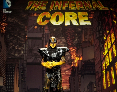
Anthony’s hero was The Infernal Core, a crackling character filled with the power of the Earth’s core. He looked DC, but only by chance. The big leathery tunic and dark aesthetic work. The tunic was only included because he couldn’t get his chest and back prosthetics molded in time. This might be the first time in the history of the show that an improvised solution was far better than the original design. Comics are all about unique silhouettes and The Core stands out from most of the DC characters at this time.

faceoff4.02anthony Face Off 4.2: Could Be Heroes

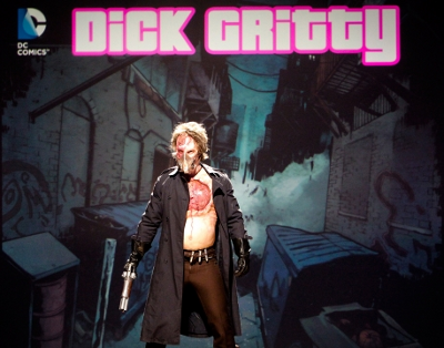
Eric F.’s hero was Dick Gritty, a techno-throwback noir detective with visible but contained organs. This cyborg concept was very well executed given the time constraints of this show and featured visible working lungs. The clear plastic covering the lungs and exposed brain read very well. It was a bit dark, like a Dark Horse horror title, but it still read superhero.

faceoff4.02ericf Face Off 4.2: Could Be Heroes

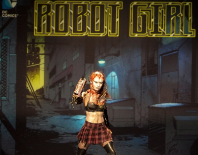
House’s hero was Robot Girl, an anime-styled cyborg fighter. The styling was very Tank Girl meets low-budget monster movie and it looked great onstage. It was off-mark for this challenge solely because of the anime aesthetic. The backstory, the sci-fi elements, even the styling choices were all anime. The judges warmed up to the design close-up when they realized the head was not bloodied but actually showed off exposed musculature and wires in the body.

faceoff4.02house Face Off 4.2: Could Be Heroes

Anthony was named the winner because he had the only DC-styled hero in the top group. Autumn probably had the most superhero looking creation on the stage, but it was straight up Marvel, down to the cut of the costume. Alam’s design was great, but her back prosthetic wouldn’t stick and her quick paint job covering for the mistake didn’t hold.

The bottom three looks were Katie, Meagan, and Michael.

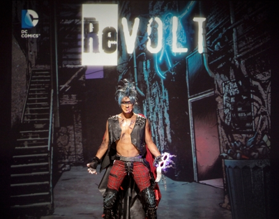
Katie’s hero was ReVolt, a punk rock vigilante who could shoot electricity. The concept was cool. She just had poor execution on everything. Her facial prosthetics for scars and injuries distorted the face like a bad Halloween mask and the mask she made for the costume was way too floppy to look right. A sewn fabric hood would have had the same effect without looking like a rubber dog treat.

faceoff4.02katie Face Off 4.2: Could Be Heroes

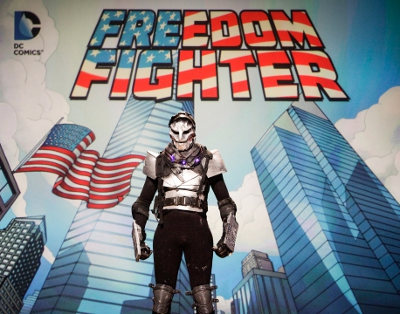
Meagan’s hero was Freedom Fighter, a man with armor constructed from the remains of the Twin Towers. Poor subject matter aside, the execution was terrible. The facial prosthetic was really uneven and she used duct tape to fasten her prosthetics. The saving grace here was a really cool collar piece that showed where the rest of the design should have gone.

faceoff4.02meagan Face Off 4.2: Could Be Heroes

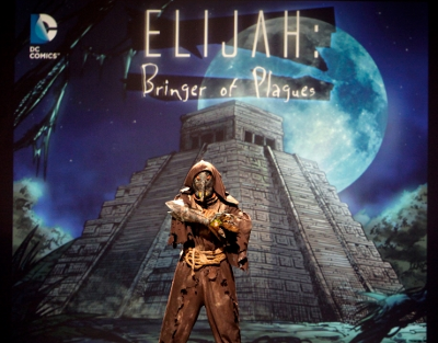
Michael’s hero was Elijah: Bringer of Plagues, a mythical hero who could absorb and shoot out disease. It felt very DC to me. It was just really poorly executed. Michael struggled in the work room to create the signature plague mask of his character and barely put any makeup on his model. That’s bad. This is a makeup competition. How do you do a design without real makeup work on it? The character was screaming for some disgusting face and body paint but only a few random squirts of green could be seen.

faceoff4.02michael Face Off 4.2: Could Be Heroes

Michael was sent home for not doing makeup on a makeup reality show. Simple as that. It’s just really odd that SyFy has used this makeup for weeks to tease the show and it’s the worst in the challenge.

Thoughts on the episode? Share them below.

Face Off 4.1: Of Kings and Queens

SyFy’s best series Face Off (well, best among their current line-up) is back with a slightly modified format that raises the quality of the show in the best way possible. Host MacKenzie Westmore’s father, Academy Award-winning makeup artist and Star Trek creature designer Michael Westmore, is now the permanent mentor for the contestants. The father/daughter team tour the studio and offer actual advice to the contestants.

faceoff4.01westmores Face Off 4.1: Of Kings and QueensIn previous seasons, Ve Neill, Glen Hetrick, and Neville Page would visit and check on the contestants. They couldn’t really offer advice because that would be favoring one contestant over another. Now, Michael Westmore and even MacKenzie herself can offer advice and suggest changes/techniques to fix the makeup before the judges see it because they’re only there to support the contestants. It’s a great change that resulted in the best execution for a first challenge so far on the show.
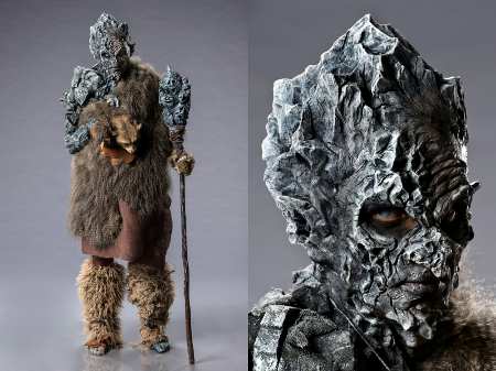
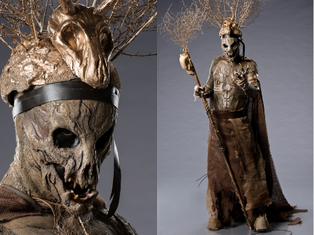
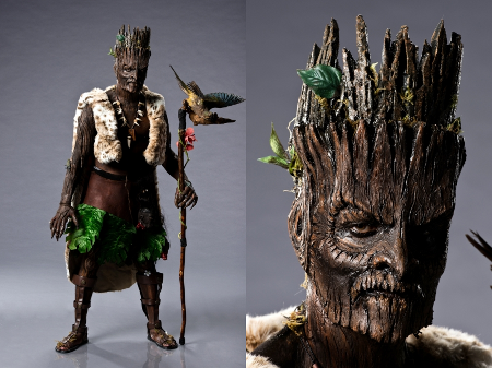
This season, 14 contestants are playing for a guest lecture series at Make Up Ever Academies in New York and Paris, a 2013 Fiat 500, and $100000. They’ll compete in two challenges a week–a Foundation Challenge to win an advantage or smaller prize and a Spotlight Challenge to design a full body makeup–until, presumably, they crown the winner at a live season finale.

The Foundation Challenge this week got rid of the environmental elements that failed miserably last year (but worked great in season 1 and 2) and instead gave the contestants crowns for inspiration. Each artist chose a unique crown to design a Queen makeup around with wardrobe, wigs, and identical makeup kits provided. They had to show their personal style and approach to makeup as well as create a design that fit with the crown they chose.

The winner of the Foundation Challenge was Anthony. He created an alien queen with a prefab bunny nose prosthetic that looked good enough to film. Other standouts included the wild horror makeup of Eric F.’s Queen of Lost Souls and Jenna’s warrior queen that was all about strength and beauty.

The Spotlight Challenge picked up right where the contestants left off: kings. Specifically, high fantasy goblin kings. The contestants were randomly split into seven teams and each had to chose an environment from an ancient fantasy map for inspiration. Each team had to design a king and a crown that matched the environment they chose.

The top three teams in the Spotlight Challenge were Anthony & Megan, Eric F. & Jenna, and Eric Z. & Autumn.

Anthony & Megan created a Mountain king who actually looked like rock. Michael Westmore stressed how important the accuracy of the rock formations would be to the success of the makeup and the team took it to heart. This really looked like the rocks were slowly overtaking the old king, with only the slightest hint of humanity left in the softer left side of his face. This was a really well-executed makeup from conception to fabrication.

faceoff4.01anthonymegan Face Off 4.1: Of Kings and Queens

Eric F. & Jenna went to horror town again for their Desert King. The team sculpted their design so fast that they actually had their main molds poured, cured, and separated before the end of the first day. That meant they had the entire second day to work on fabrication and extra touches, like sheets of raw flesh to cover any exposed body with. The fast work and careful execution paid off big time with a powerful makeup that read great up close and at a distance.

faceoff4.01ericzjenna Face Off 4.1: Of Kings and Queens

Eric Z. & Autumn had the most trouble in the studio but pulled off a really cool look for their Jungle King. They created a living Tiki with natural wood detailing for musculature on the arms. The paint job on the wood was really strong and their fabricated costume elevated the concept enough to be noticed.

faceoff4.01autumnericf Face Off 4.1: Of Kings and Queens

Ultimately, the judges were so blown away by the level of detail in Anthony & Megan’s painting and sculpture that their Mountain King was declared the winner. Anthony was given the challenge win–making him 2/2 this season already–for his sculpture work.

The bottom two teams were Michael & Troy and Wayne & Alex.

Michael & Troy didn’t do anything particularly wrong with their Volcano King. They just did nothing right. They fabricated a costume that completely covered up their chest sculpture–Ve stressed many times it was the best part of their makeup–and created a cartoonish crown that was completely at odds with the actual applied makeup. There was no concept beyond streaking lava on the model and it showed.

faceoff4.01michaeltroy Face Off 4.1: Of Kings and Queens

Wayne & Alex screwed up their time management on their Swamp King. Michael Westmore said they would easily win if they got the paint job right; they didn’t even paint it. Their concept was a gator king and they sent out a gray scaly blob with armor that looked like washboards. A better paint job would have distracted the judges from the mishmash of bayou cliches going on in the armor.

faceoff4.01waynealex Face Off 4.1: Of Kings and Queens

The judges decided that Troy was responsible for the single worst element of the Volcano King, the face sculpt, and he was sent home. I can’t disagree with the judges on this one. I honestly would have loved to see them critique all the contestants since I thought Alam & Kristian’s Forrest King and (especially) House & Katie’s Arctic King were very strong, as well. If this episode is an indication of the talent level this season, I do not envy the judges having to send someone home each week.

Did you catch the season premiere? What did you think? Sound off with your thoughts below. And let’s give it up for SyFy bringing back their excellent photo galleries to showcase the designs and contestants in the best way possible. You can check them all out here.