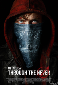
 Metallica: Through the Never tries something very unusual for a modern concert film. The band members worked with writer/director Nimród Antal to develop an original story set to their set list to play out during the live concert footage. Dane DeHaan plays Trip, a young roadie sent on an important mission during the concert to retrieve an item for the band. What he wanders into is a world strewn in chaos. It’s as if the music of the band has altered reality, creating riots and nightmarish monsters on every corner. It’s an intriguing concept that breaks up the concert footage very well.
What we have here is a bit of fan service so well-executed that anyone not totally averse to the music of Metallica will find something to enjoy. I, personally, was in it for the Dan DeHaan narrative while my brother was there for the music. Everything is really well shot. The editing is solid. The 3D is clean and immersive without too many gags or distractions.
The real star of the film is the sound design. The balance between the music and the live audience is perfect. You’re allowed to experience the band’s skills within the context of the natural energy of the audience. Arena tours have notorious sound issues because the physical arenas are not designed for live music and this team recorded everything beautifully.
It continues on with the Trip’s story in the film. The sound effects added in–car crashes, explosions, police batons, etc.–sync well with the music. It’s a bit more subtle than the manipulation of levels in the pure concert scenes but it’s solid work. It would be all too easy to distract from the music or the storytelling by shifting the balance too far one direction or the other and that never happens.
What does happen is the sad realization that Trip’s story is under developed. It’s basically a long form music video punctuated by scenes of live performance from the band. The individual vignettes are good on their own. I’m quite fond of the opening sequence where Trip rides his skateboard past fans and band members prepping for the concert, as well as a rather unsettling sequence where Trip wanders through streets filled with hanged bodies. They just don’t actually add up to a satisfactory story.
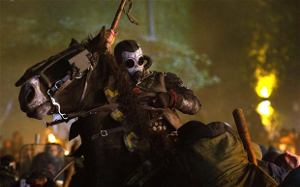
The style of Metallica: Through the Never cannot be denied
The early vignettes are clearly connected. Trip is enjoying the concert until a backstage manager pulls him aside and sends him to find a broken down truck with an important package for the band. The young roadie sets out in his van after taking some medication–prescription or street is unspecified and does color your opinion of what happens–and quickly gets into an accident. The city is being overrun with angry people while a mysterious masked horseman executes public dissenters.
There is never an attempt after the villain’s introduction to explain what’s causing the chaos or even stick to the basic narrative conceit. It shifts, quite honestly, to a series of post-apocalyptic horror cliches and music video trends that fell out of favor in the 90s. The technical execution and, indeed, Dane DeHaan’s performance as Trip, are both excellent. It’s the story itself that becomes a bit too elusive to be satisfactory.
Metallica: Through the Never is part heavy metal concert film, part experimental musical and will probably be best appreciated in a movie theater. The sound design is so key to the experience and so delicately handled that something will inevitably be lost in all but the most advanced home theater sound systems. Anyone interested in the film should seek it out in theaters. Fans of the music will undoubtedly be pleased to see such a strong and stylish presentation of the music and performance style of Metallica.
Rating: 7/10
This review is part of 31 Days of Horror at Sketchy Details. Click through for more great horror content.
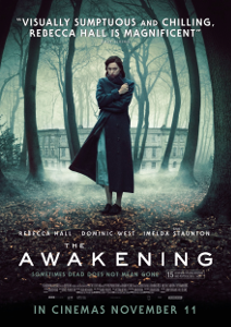 The Awakening is a haunted house film told from the perspective of a skeptic. Florence Cathcart is England’s leading paranormal investigator, debunking the schemes of spiritualists and delusions of regular people alike. In 1921, she is invited to a boarding school where the boys claim to see a ghost. A death happened on school grounds during the fall session and Cathcart is believed to be the last hope to ensure any students return for the spring.
 Metallica: Through the Never tries something very unusual for a modern concert film. The band members worked with writer/director Nimród Antal to develop an original story set to their set list to play out during the live concert footage. Dane DeHaan plays Trip, a young roadie sent on an important mission during the concert to retrieve an item for the band. What he wanders into is a world strewn in chaos. It’s as if the music of the band has altered reality, creating riots and nightmarish monsters on every corner. It’s an intriguing concept that breaks up the concert footage very well.
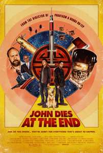 If anyone could make a sensible adaptation out of David Wong’s bizarro horror/comedy novel
 Sometimes more is better. And sometimes more is just more.
 This week on Face Off, the remaining makeup artists had to recreate a classic Halloween costume–a vampire, a skeleton, a devil, a clown, or a scarecrow–with some kind of special effects trick. This was an amazing challenge that inspired me to make one of my favorite props ever on
  In all my years of suggesting free computer games through Play It, I’ve never suggested a game that you had to download to play. I wanted a certain level of convenience to the feature. It’s always been browser games that you could click over to immediately.
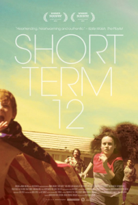 Grace is the supervisor of the day staff at a foster care facility. She’s her live-in boyfriend’s boss and uses the strength of their relationship to best suit the needs of the young people under her care. When a new foster girl named Jayden digs up memories of her own troubled past, Grace struggles to find the balance between compassion and professionalism in her career.
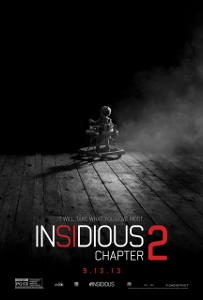 Warning: this review contains spoilers. There’s a big issue I need to discuss and the only way to get at it and how it embodies the biggest flaw of Insidious: Chapter 2 is to discuss one of the major reveals of the film.